Today I want to take some time in talking about web design principles. We have discussed its basics in our previous blog about “Web design Basics”, you can check out that.
Now I want to reinforce it to work on your project that’s especially when it came to look, the structure of your site, these are incredibly important things. They can make or break when someone does decide whether they want to stay on your site or not.
So it’s really important and we are going to continue it to cover them today. The overall goal with web design is it’s what’s called Usability. 2 people out of 10 are just the visitors and 8 people are genuine who use or visit your website. Even though your website is beautiful but quite hard for one to figure out with bad UX. Then website is a failure because no one uses the website. So usability is the key.
Personally I would rather have a minimalistic very usable site than a credibly ornate site that the no one can figure out. Now if you can find a happy medium between these 2 and so have a site that looks incredibly good and it’s easy to use that you hit the Holy Grail of a website design.
So when it comes to usability –
It is the measure of the quality of a user’s experience when interacting with a product or system. So like I just said if somebody can use your site then you have high usability. If they can figure out where to go they can understand your navigation if they know OK! If I click here I am going here, these are all things that need to be considered when it comes to usability, and there are 5 things to consider with your website or regarding usability:
- Ease of learning –
Now when you are writing content on a website we essentially try to help people with the information so if someone can understand your content and can use your website to learn, that leads to high usability.
- Efficiency of use –
That goes along with the navigation and just the overall structure of your site, if they can’t find where they want them to go, your site is not usable so making sure it is as clear as possible in terms of a letting people know how to use your site that leads to high usability.
- Memorability –
You want people to remember your site. Especially when you are come for job interview if you are up against the couple of other candidates and they want your digital portfolio and they really remembered your site that can be review about the other just that reason you should want your site to be incredibly memorable.
- Error frequency –
You obviously want that to be really low. A low error free frequency means high usability. So this is everything from coding errors to the areas of navigation everything regarding errors on your site. You want them as low as possible.
- Subjective Satisfaction –
This is just the people like about your website. It is a nice site do you like yourself to people / customer like it?
So need to consider those 5 things when it comes to usability:
There are 4 elements for web design:
- Page layout and structure
- Fonts and typography
- Color
- Images and graphics
We will go in detail in each of these elements:
- Page layout and structure-
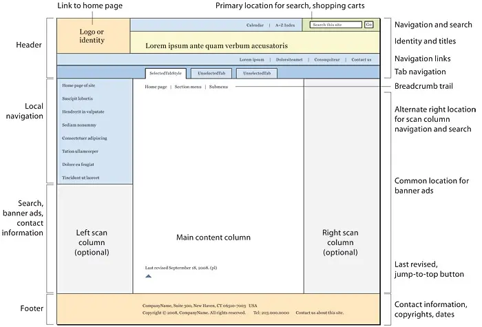
There are tons of ways you can structure a site. For example: Grid layouts. There are some layouts where there are many squares you can use them for store’s website and image having different products or images being displayed there in each square. For news sites there are layouts. There are layouts for standard and school sites. So letting the page layout correctly before designing the website is – really important. So please place the contents where you need to be and it adds to that usability because you have a plan in place.

There are couples of things to be considered when you are thinking about layout structure the content on your page has to show in the browser when people load the page. So if you built a huge site that continues to go all the way up to screen that is a disaster. People are not going to scroll horizontally so in other words you need to keep your content contained.
So this is where the containers do by coming to place where you want other things to be considered are
– You want to know what is on your page.
This looks very familiar. You need a header, navigation system, main content and footer, so this is what we use in all the HTML file tags to structure that content. So again this should not be anything new you have already done this in class with your project. This will continue to go on as you continue to build more and more sites.
Contents should be structured and should be easy to read and consistent more than everything else.
- Fonts and Typography –
When it comes to fonts and typography we use fonts and typography on the web, do we use them to make the content easy to read or do we use them for web pages to look pretty?
Hopefully you answered both because that’s truly the answer but of those 2 options first should be the main one. So we do want our fonts and typography of our sites look pretty. So I don’t want to do that. But if your content is not good then prettiness of your fonts does not matter so the answer is both with a more emphasis on the first one. And as you know we can tell a browser which font we want to use. So this is done through CSS and you can define body inside your CSS and then have a font family and what it does is that it gives the browser and the order of the way you want them. So what this to say is I want to use Arial if the user does not have Arial on their computer then let it go. If the user does not have Haettenschweiler, you can go ahead and set up this order in your CSS.
So let the browser know which type of font you want to use? Again remember pixels are the way we use major fonts and here we just mentioned. Sans serif. It depends on your preference.
- Colors-
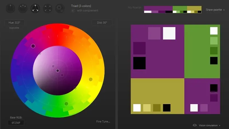
The main thing here is when you have too many colors on your site you have no color because you really want color to serve a purpose. Color is not on your site to show that you love really loud colors or that you like a bunch of different colors. You want the color to show attention to one thing. You want it to be consistent so you don’t want hot pink on one page and then yellow on another page or orange on another page. You want your site to be consistent color thread. So again too many colors = no color.

Please remember that. We measure colors in RGB frames – R = Red
G = Green
B = Blue
And hexa codes you should already know them. We have number of possibilities of Red, Green and Blue shades. So if you have 0fffffff then it is white etc.
You might want to have a main color and then use its shades, tints and tones of that throughout your website.
Tints: adding white
Shades: adding black
Tones: adding grey.
There are tons of color sites on the web, you can take their help.
- Images and Graphics on your site –
The main thing is Image size should be small. You usually do not want an image size that is more than 100KB. This is because anything higher than that might take somebody aloof for that image to low. If it’s taking aloof for images to load think about when you go to a site that takes infinite time for images to load, you think what’s going on with that site? I don’t like it. So you want those images to load quickly. If you have a graphic with limited color or small logo that’s size is probably 20KB so the smaller is the file size is the better.

So remember it unless you are doing photography site people are not expecting the highest or high quality images on your site. So yes the image should look good but you don’t want that file to be so big that people can’t load it.
You also want to make sure that you use appropriate file formats for most photos, it can be jpeg or with e or without e both are the same just depends on how you have the image saved. So ensure that you pay a close attention to that. Sometimes files are saved in different programs with the e sometimes without so if you have a image which has a problem with loading or your image is not showing, make sure that you have the proper extensions and when you build graphics using their png file if you don’t have a lot of a color on it then use a gif file and png is high quality. So if you are building a logo or graphics for your site and it’s not very expensive in terms of colors with gif file for that, optimize your images in Photoshop before you upload them to the web.
There you have some short information on design principles. Make sure you are applying all these things to every project you build.
Visit- Hostripples

You must log in to post a comment.